
Coral Travel
A tour operator website for searching, comparing, and booking tours online: it helps users choose a destination, hotel, and flight, then complete the trip in a clear digital flow.

About the project
Coral Travel is a tour operator website with a large number of destinations, hotels, promotions, seasonal offers, and purchase scenarios: from searching for a package tour to booking a hotel and arranging a trip online.
The task was not simply to refresh the visual presentation, but to rethink the user journey: how a person chooses a destination, compares hotels, checks tour conditions, trusts the price, and reaches booking without unnecessary anxiety.
Business problem
On a tour operator website, the user makes an expensive and emotionally significant decision. They compare dozens of options and worry about making a mistake with the hotel, dates, flight, meals, transfer, documents, and payment terms.
Travel websites are often overloaded with filters, banners, special offers, and technical details. The user sees a lot of information, but does not always understand which option is best for them. The main risk is losing the user between tour search, results, hotel card, and booking checkout.
Business task
Simplify the key online tour search and booking scenario on the Coral Travel website.
The key goal is to make the user journey clearer: from choosing a destination and dates to comparing options, viewing a hotel, selecting tour conditions, entering tourist details, and completing payment. The interface should help users make decisions faster while maintaining a sense of reliability.


Action plan
To design a clear digital scenario for a tour operator, I broke the task down into several stages: analysis of the current user journey, research into tourist behavior, competitive analysis of travel services, and work with filters, tour cards, hotel comparison, and the booking process.
The task was not to redesign the visuals for the sake of visuals, but to create a more manageable choice experience. The user should quickly understand where they are, which parameters have already been selected, what affects the price, and what actions should be taken next.
The goal was to find a balance between business objectives, a large amount of travel content, and real user needs: quickly find a suitable tour, check the details, reduce anxiety, and safely complete the purchase online.
Target audience research
The research was aimed at understanding how users choose tours online and why part of the audience still prefers to contact a manager or travel agent. The focus was on motivation, fears, selection criteria, familiar search scenarios, attitude toward online payment, trust in reviews, and the importance of photos, filters, flight conditions, meals, transfers, and support.
The results showed that four things are especially important for a tour operator’s audience: clear search, honest comparison of options, transparent tour conditions, and a sense of support at every stage. Users want to choose independently, but they do not want to be left alone with a complex system, so the interface should not just show options — it should help users make decisions.
Interview questions
Current experience
Interface experience
Pain points
Expectations
Job stories list
Based on interviews and collected insights, I created Job Stories to capture real user tasks, identify key pain points, and define which solutions should form the foundation of the tour operator website design.
Analysis findings
The user is not choosing a tour — they are reducing risk
For most people, buying a tour is not just about choosing a hotel. It is a high-stakes decision involving vacation, family, dates, money, documents, and expectations. That is why the interface should not only sell, but also reduce anxiety.
Search results should help users choose, not just show options
A large number of tours is not an advantage by itself. Users need to quickly narrow down the choice by budget, type of vacation, meals, rating, beach, flight, travel party, and important restrictions.
Hotel comparison is a key decision-making tool
Users often choose between several similar options. If comparison is turned into a separate and clear scenario, it reduces cognitive load and helps users move to booking faster.
The tour card should answer anxiety-driven questions
Before purchasing, the user wants to understand what is included in the price, which flight is offered, what meals are included, where the hotel is located, what the reviews say, whether transfer is included, which documents are required, and what happens after payment.
Online booking requires trust
The closer the user gets to payment, the more important transparency, support, clear steps, saved data, error checking, and status explanations become.
Promotions and special offers should not break the main scenario
Travel websites are often overloaded with banners, last-minute tours, and seasonal promotions. These blocks are important for sales, but they should not interfere with the user who is already in the selection flow.
Competitor analysis
For Coral Travel, I studied tour operator websites, travel aggregators, and booking services to understand how different products solve the tasks of tour search, filtering, hotel comparison, offer cards, and online booking.
It was important for me to see how users move from a general desire to “go on vacation” to a specific tour with dates, hotel, flight, and payment. The analysis showed that a travel product wins not through the number of offers, but through a clear selection flow and transparent presentation of conditions.
Competitors





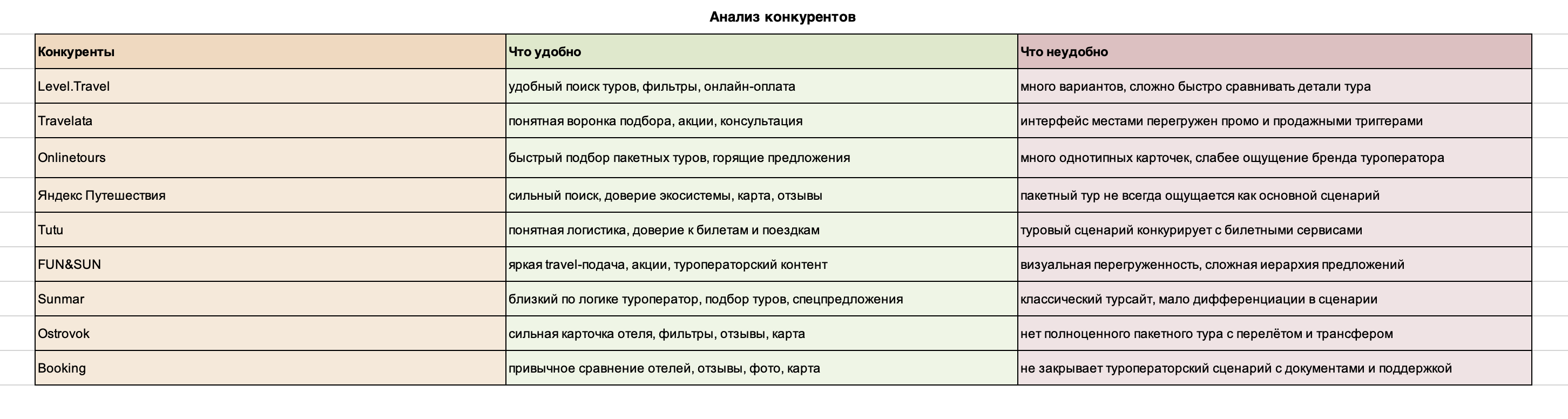
Solution hypotheses
The hypotheses were based on several principles: quick entry into search, clear search results, manageable filters, hotel comparison, a transparent tour card, step-by-step booking, support at critical stages, and the personal account as a control point after purchase.
The key idea is that the user should quickly understand which tours suit them, why they cost exactly that amount, and what will happen after booking.
Hypothesis 1. Quick entry into tour search
Hypothesis 2. Search results as a decision-making tool
Hypothesis 3. Filters should reduce overload
Hypothesis 4. Hotel comparison helps users make a decision
Hypothesis 5. The tour card should answer anxiety-driven questions
Hypothesis 6. Booking should be step-by-step
Hypothesis 7. The personal account continues the scenario after payment
All hypotheses were taken into work and implemented in the interface
Scenario development
At this stage, I relied on the created Job Stories and built user flows for the key user journeys.
This helped break down the main actions step by step, understand the structure of each path, identify potential error points, and remove unnecessary actions before moving on to prioritization and detailed interface design.
In the case study, I showed only two scenarios: tour search and ticket search.


Tour search and start of selection
This section shows how the user first enters the Coral Travel website, sets the basic trip parameters, and receives the first relevant offers. The scenario was made as clear as possible to lower the entry barrier: departure city, destination, dates, number of tourists, and tour duration should be readable immediately, without the feeling of filling out a complex form.
Tour selection scenario
After starting the search, the user enters a more complex part of the product — the tour results page. Here, the main task of the interface is no longer to start the scenario, but to help the user choose from a large number of similar offers.
In this scenario, the structure of the tour card, sorting, filters, saved parameters, clear pricing, and quick access to details are important: hotel, meals, flight, rating, location, payment terms, and tour composition. The interface should help users compare options without unnecessary transitions and preserve context so that the user does not get lost between results, filters, and the offer card.


Help choosing a tour
This scenario was created for users who are not ready to book a tour on their own right away or who have doubts about their choice. Through prompts, quick contact forms, and support touchpoints, the interface helps users move from independent search to consultation without losing their selected parameters.

Destinations and vacation types
On Coral Travel, choosing a destination and vacation format is not presented as one separate section, but as a system of connected blocks and pages: country navigation, last-minute tours, promotions, seasonal selections, popular destinations, and themed offers. These blocks work as alternative entry points into the selection scenario. The user may start not with an exact search query, but with a more general intention: to look at good deals, choose a country, find a vacation for a specific season, explore popular destinations, or switch to domestic travel. This is important for the interface because part of the audience does not arrive with a ready-made decision, but with a need to orient themselves and gradually narrow down the choice.

Comparison and favorites
This section was created as a decision-making tool. Users can save tours they like and compare options by important parameters: price, rating, meals, location, beach, conditions for children, flight, and tour composition. This reduces overload because users do not need to open every card separately and manually remember the differences between similar hotels.

Tour card and hotel details
This section was created to gather all critically important information before booking in one clear interface. The tour card should answer the user’s main questions: what is included in the price, which hotel is offered, which room, what meals, which flight, whether transfer is included, what the reviews say, where the hotel is located, and which payment options are available.

Checkout, payment, and booking status
This section shows the final part of the scenario: entering tourist details, checking information, confirming conditions, choosing a payment method, and creating an order. After payment, the user should see the booking status, documents, receipt, contract, tourist details, payment information, and support contacts.


Promo blocks and destination cards
For Coral Travel, a system of promo blocks, destination cards, promotions, and seasonal offers was designed. These elements help not only show the assortment, but also guide the user toward a suitable scenario: last-minute tours, early booking, family vacations, beach destinations, premium hotels, or offers with favorable conditions. It was important to make promotions noticeable without turning the page into a chaotic banner showcase.

Interviews and UX tests
Interviews and UX tests showed that the main barrier for Coral Travel is not the lack of options, but the complexity of choice and fear of making a mistake. Users could quickly find a tour, but often had doubts before the final decision: whether the hotel is suitable, whether the price will change, whether everything is included in the tour, whether the documents are filled in correctly, and what will happen after payment.

Results
The exact project metrics remain confidential, so I do not include internal numbers in the case study.
However, all solutions were designed as testable product hypotheses: for each change, we defined which part of the user journey it affected and which metrics could be used to evaluate it after launch.
The focus was on reducing unnecessary actions, improving search clarity, improving tour comparison, and reducing user anxiety on the path from choosing a destination to online booking.
