
Rapido
A dynamic online lottery with a fast game loop
About the project
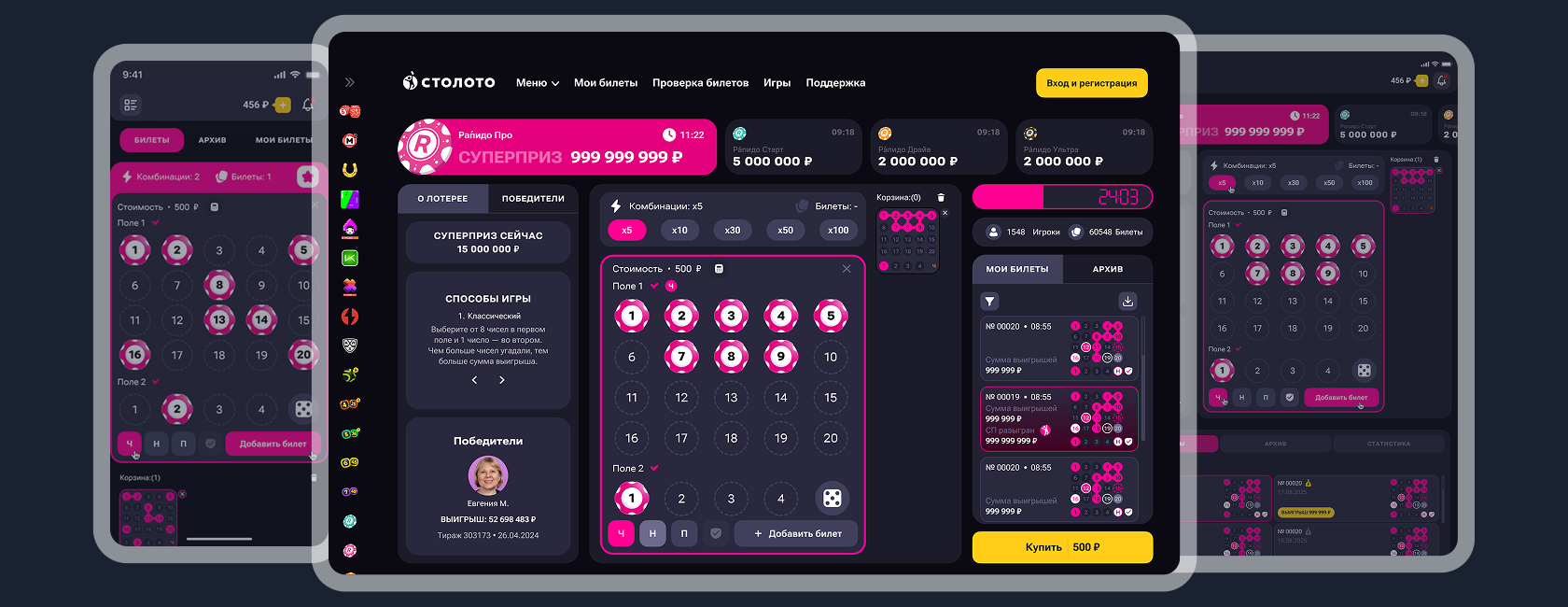
Rapido is a digital Stoloto lottery with a fast game loop, where users need to quickly choose a combination, purchase a ticket, and wait for the draw result.
Business problem
Despite the product’s popularity, some users struggled with a complex number selection and ticket purchase flow. The team also observed that the interface did not always guide users quickly enough from entering the game to completing the purchase, which caused part of the audience to drop off before payment.
Business goal
Reduce the number of users dropping off before buying a ticket, increase payment conversion, and make participation in the draw faster, clearer, and easier.
Action plan
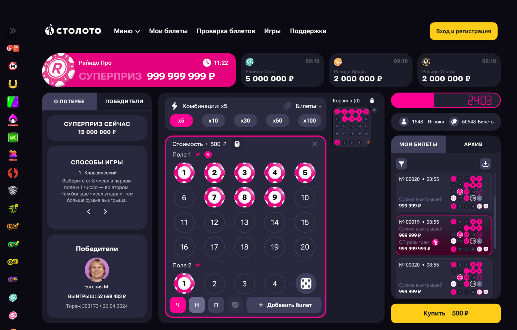
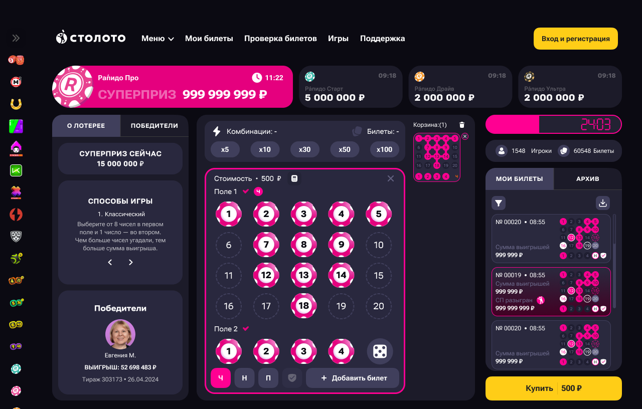
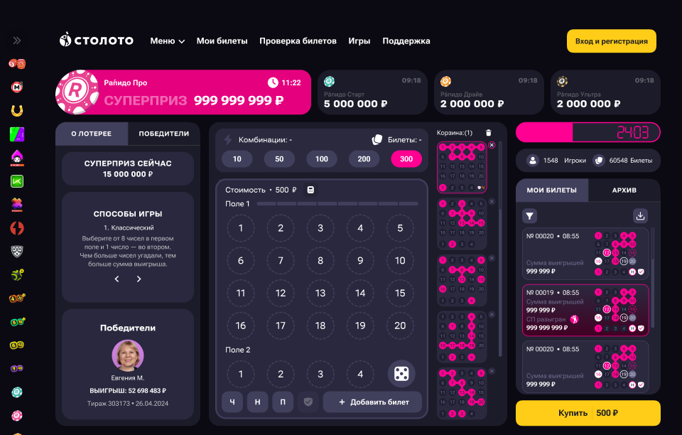
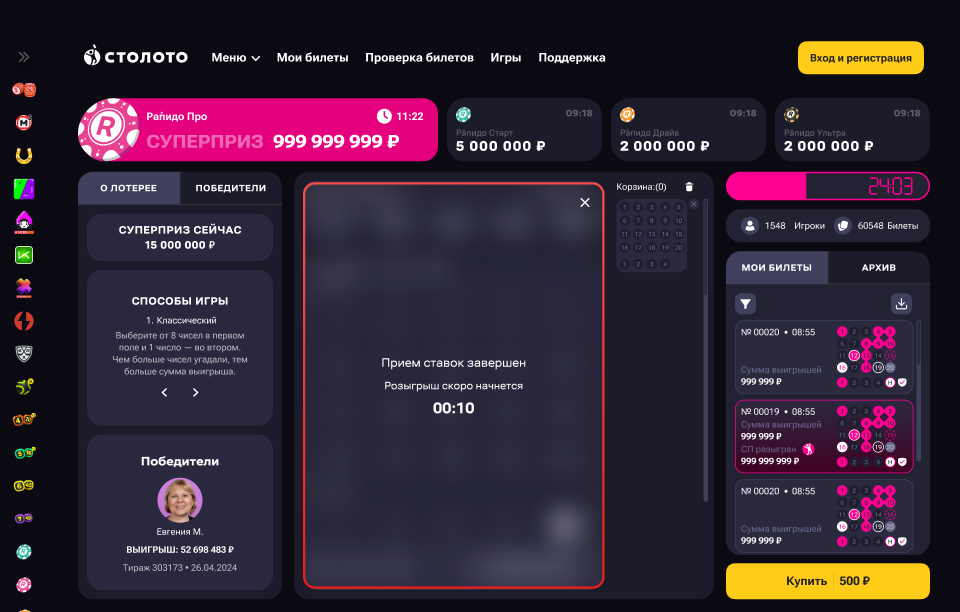
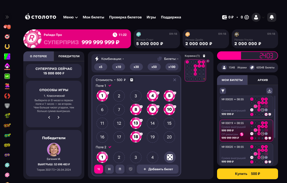
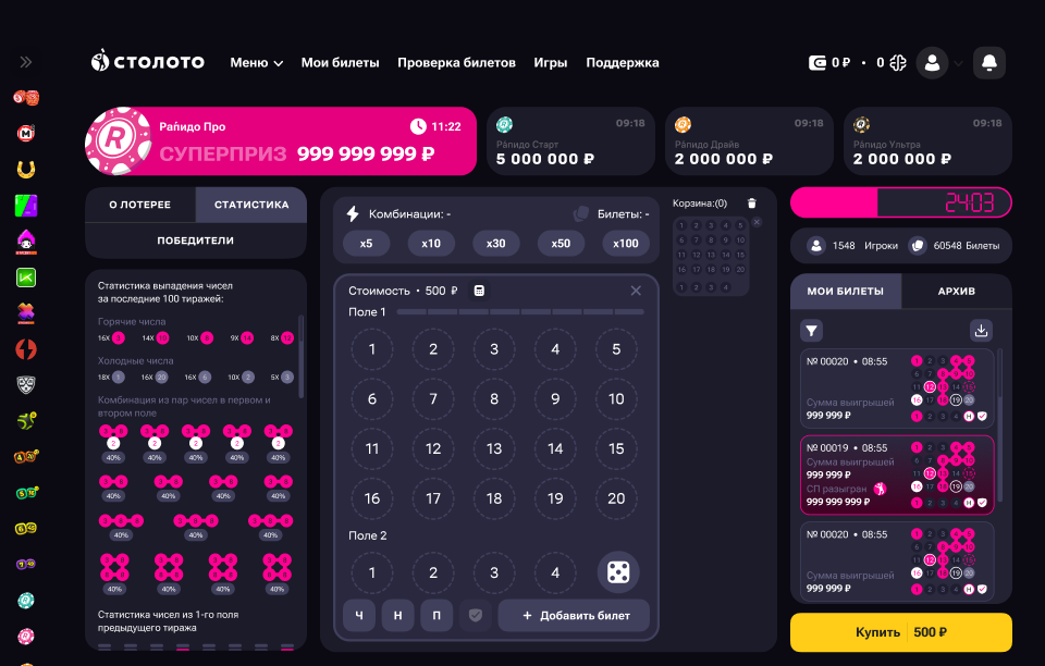
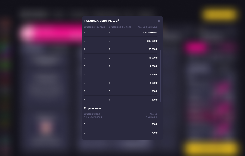
To understand which interface logic would be more effective for Rapido, I explored two hypotheses proposed by two product managers and developed two full screen concepts.
Both concepts addressed the same business goal — simplifying participation in the lottery and increasing ticket purchase conversion — but each relied on a different interface principle.
The goal was to test how different arrangements of game elements affect perception, ease of filling in the ticket, and the user’s readiness to reach payment.
User research
The business team shared a base of active players, and I conducted 10 interviews with Rapido users. That turned out to be enough: after several interviews, the same behavior patterns, expectations, and barriers started to repeat, while the next respondents confirmed the same observations.
In other words, saturation was reached, and expanding the sample at that stage no longer made sense.
The interviews helped reveal how users choose numbers, how they perceive the game field, what prevents them from filling in a ticket quickly, and at which point doubt appears before payment.
It also became clear that for some users, logic and predictability matter most, while for others, visual order, screen integrity, and a sense of simplicity are more important.
Interview questions
Current experience
Pain points
Working with the interface
Expectations
Job stories
Based on the interviews and the insights collected, I formulated Job Stories to capture real user tasks, highlight the key pain points, and define which solutions should become the foundation of the design.
Competitor analysis
I selected competitors using three criteria: popularity in the region, relevance to lottery or a closely related gaming category, and similarity of user tasks — this is how the list of direct competitors was formed.
I also added services with similar interaction mechanics: they solve comparable user tasks through interface design, even if they are not directly lottery products.
For example, such products show how interface design can solve a similar user task: “When I want to make a quick choice and immediately move to the result, I want to see a clear and convenient screen so I do not waste time on unnecessary actions and do not hesitate before the next step.”
Competitors





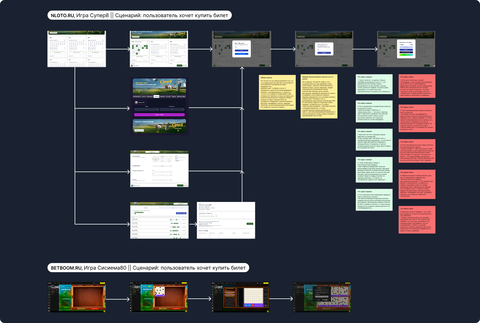
Insights from the analysis
Clear and simple layout
The most effective screens are the ones where users instantly understand what matters most: the game field, selected numbers, ticket price, and the next action. The less visual noise and the fewer competing accents there are, the faster a person engages with the game.
Filling in the ticket
The most convenient approach is to reduce the path to a few clear actions: selecting numbers, checking the combination, and moving to purchase. If the screen is overloaded or the logic is fragmented, users spend more time figuring things out and hesitate more often.
Transition to payment
One of the key factors is how quickly and clearly a user can move from filling in the ticket to payment. The main problems are usually that the purchase button is not prominent enough, the total cost is not immediately readable, and the next step feels unclear.
Adaptation across devices
The same interface is perceived differently on desktop, tablet, and mobile. If you try to fit everything on a single screen at any cost, you may gain integrity but lose readability and ease of use. The balance between compactness and clarity turned out to be crucial.
Errors and hesitation
Users need to quickly understand that the ticket has been filled in correctly and that nothing has been missed. If that feeling is absent, the likelihood increases that a person will start double-checking the screen, get confused, or fail to reach payment at all.
Visual order
Symmetry and a neat grid do create a sense of order and trust. But by themselves they do not guarantee better conversion. Aesthetics work best when they support clear logic rather than replace it.
Solution hypotheses
Based on the analysis, I formulated several hypotheses for validation. For each of them, together with the product manager, we defined the metrics in advance so that the effectiveness of the proposed solutions could later be evaluated objectively.
Layout 1 — logic and live draw first
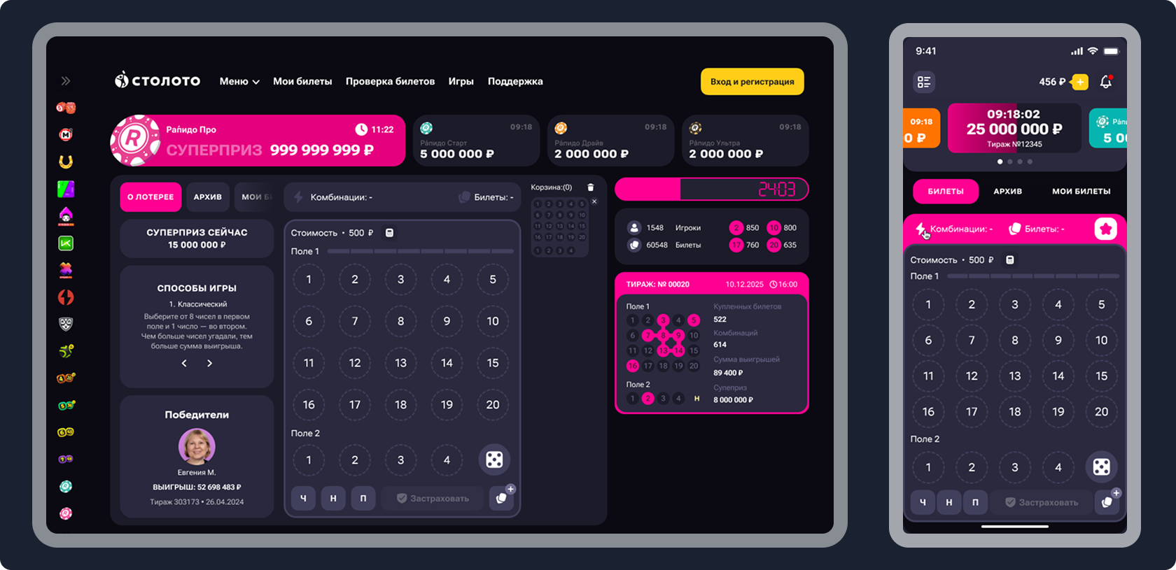
Hypothesis 1
Why it was designed this way:
Because of that, the interface was intentionally made asymmetrical: the right column works as an engagement zone and strengthens the sense of urgency.
Hypothesis 2
Why it was designed this way:
In other words, the screen does not try to be perfectly even — it follows the natural sequence of perception.
Layout 2 — symmetry and screen integrity first
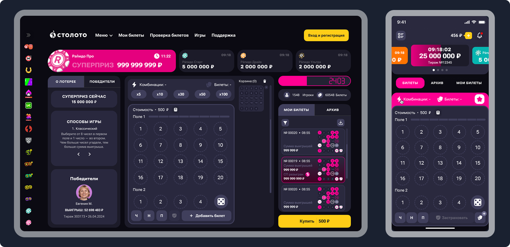
Hypothesis 1
Why it was designed this way:
When blocks are assembled into a stable composition, the interface feels more coherent, neat, and predictable.
Hypothesis 2
Why it was designed this way:
Users immediately see the game field, basket, tickets, price, and purchase button without switching between different zones or screens.
User flows
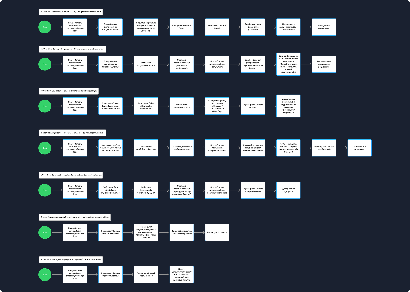
At this stage, I relied on the formulated Job Stories and built user flows for the key user journeys.
This helped break the main actions into steps, see the structure of each path, and identify potential error points and extra actions before moving on to prioritization and detailed interface design.
To keep the case from becoming overloaded, I show the mobile version next: it is more compact, while its logic and functionality fully repeat the desktop concept.
Mobile version design for Rapido
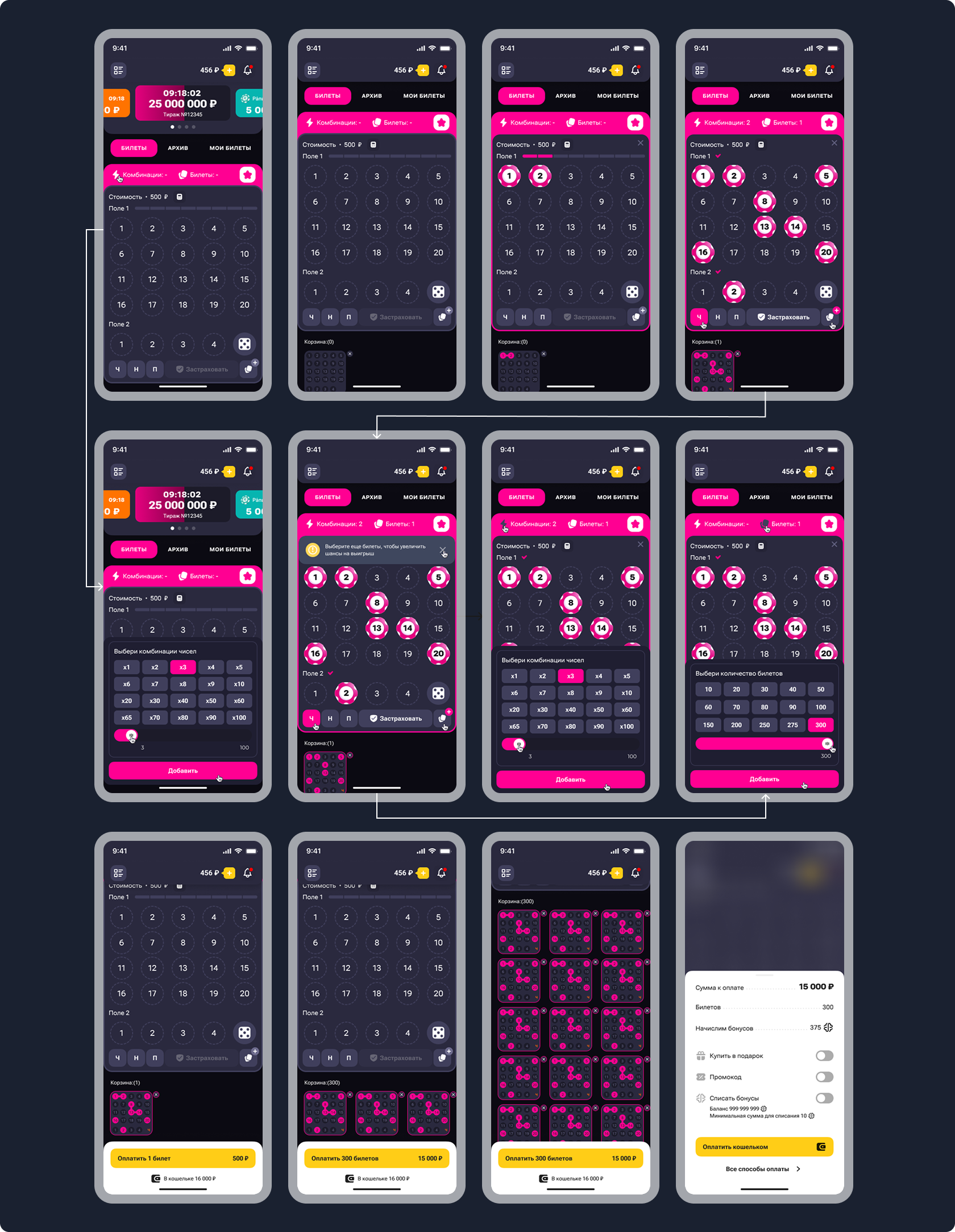
After defining the priority scenario, I moved on to the first iteration of Rapido layouts.
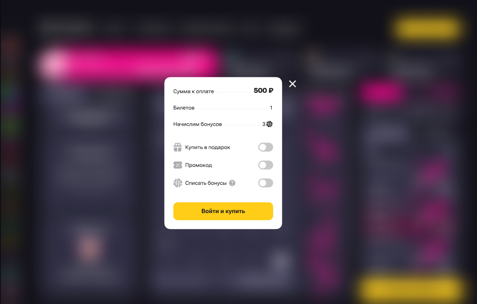
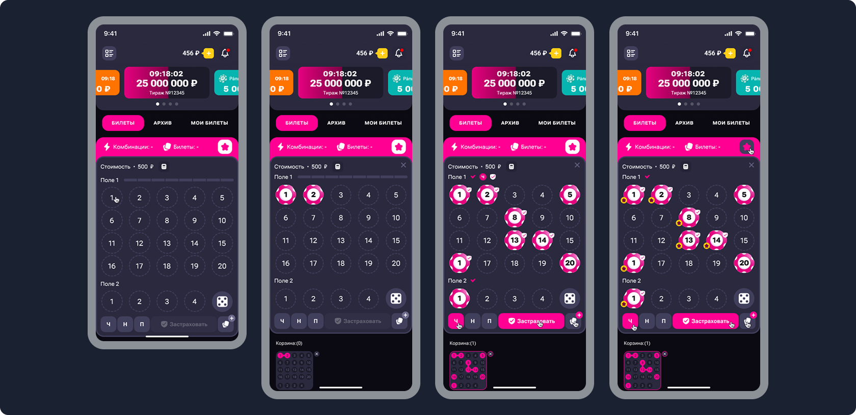
Bet insurance flow
I designed bet insurance as a native part of the gameplay so that users could quickly enable it while filling in the ticket, without being distracted from the main task.
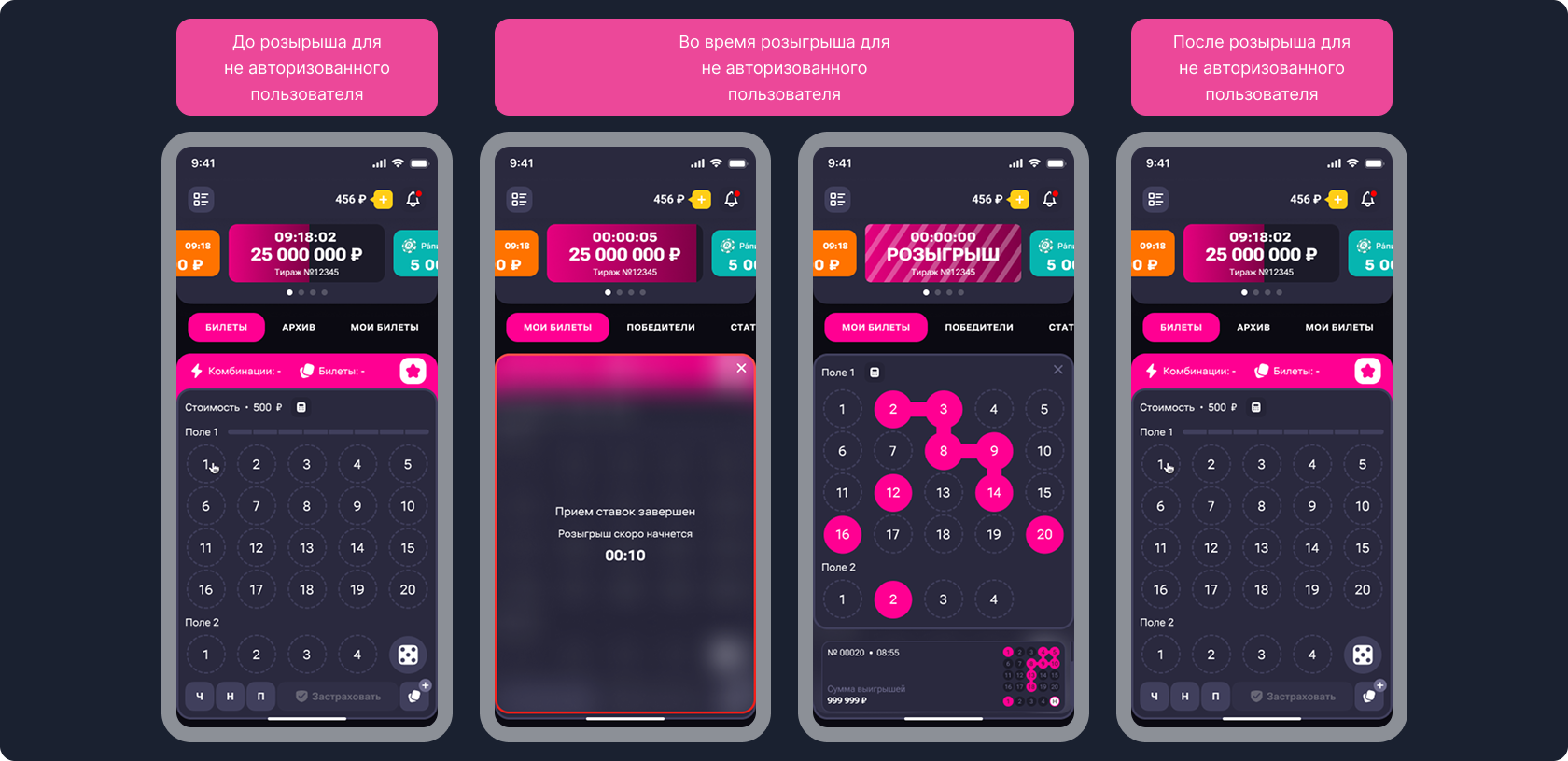
Unauthorized user flow
I worked through interface states for unauthorized users at different stages of the draw to show how action availability changes and how the screen behaves depending on the draw status.
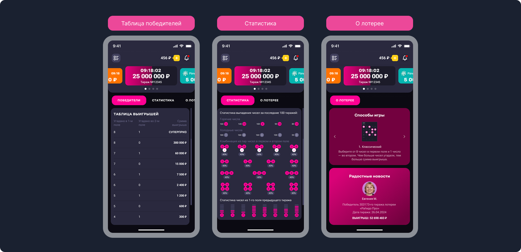
Lottery information sections
I moved winners, statistics, and lottery information into separate sections to give users more context, increase trust in the product, and avoid overloading the main game screen.
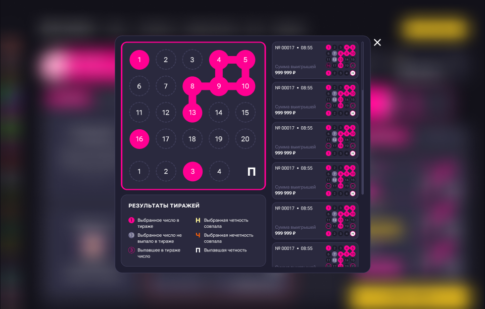
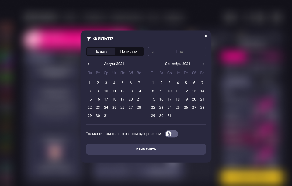
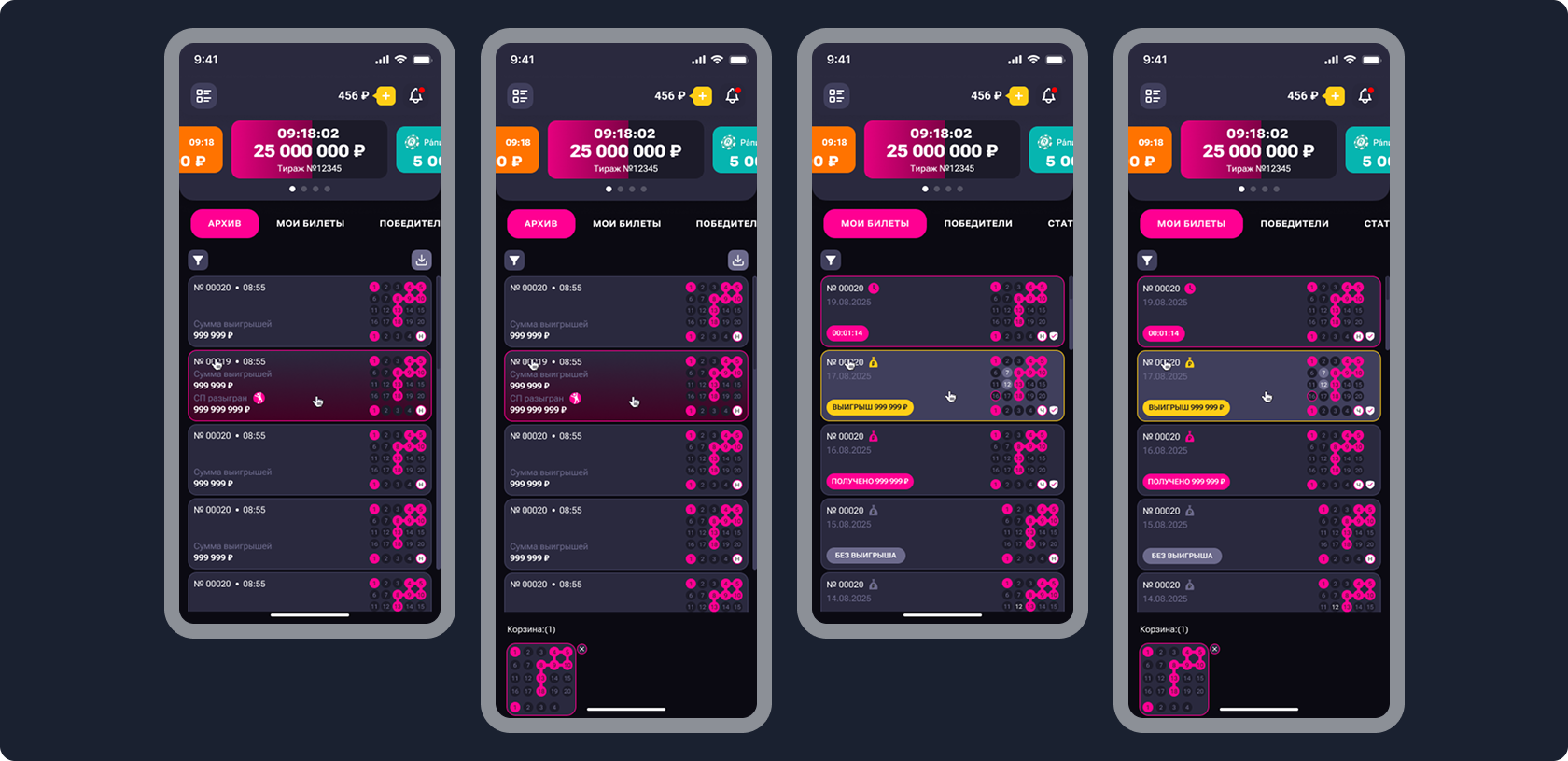
My tickets and archive
I separated active tickets and archive into different sections to simplify navigation, make statuses clearer, and help users find the needed draws faster.
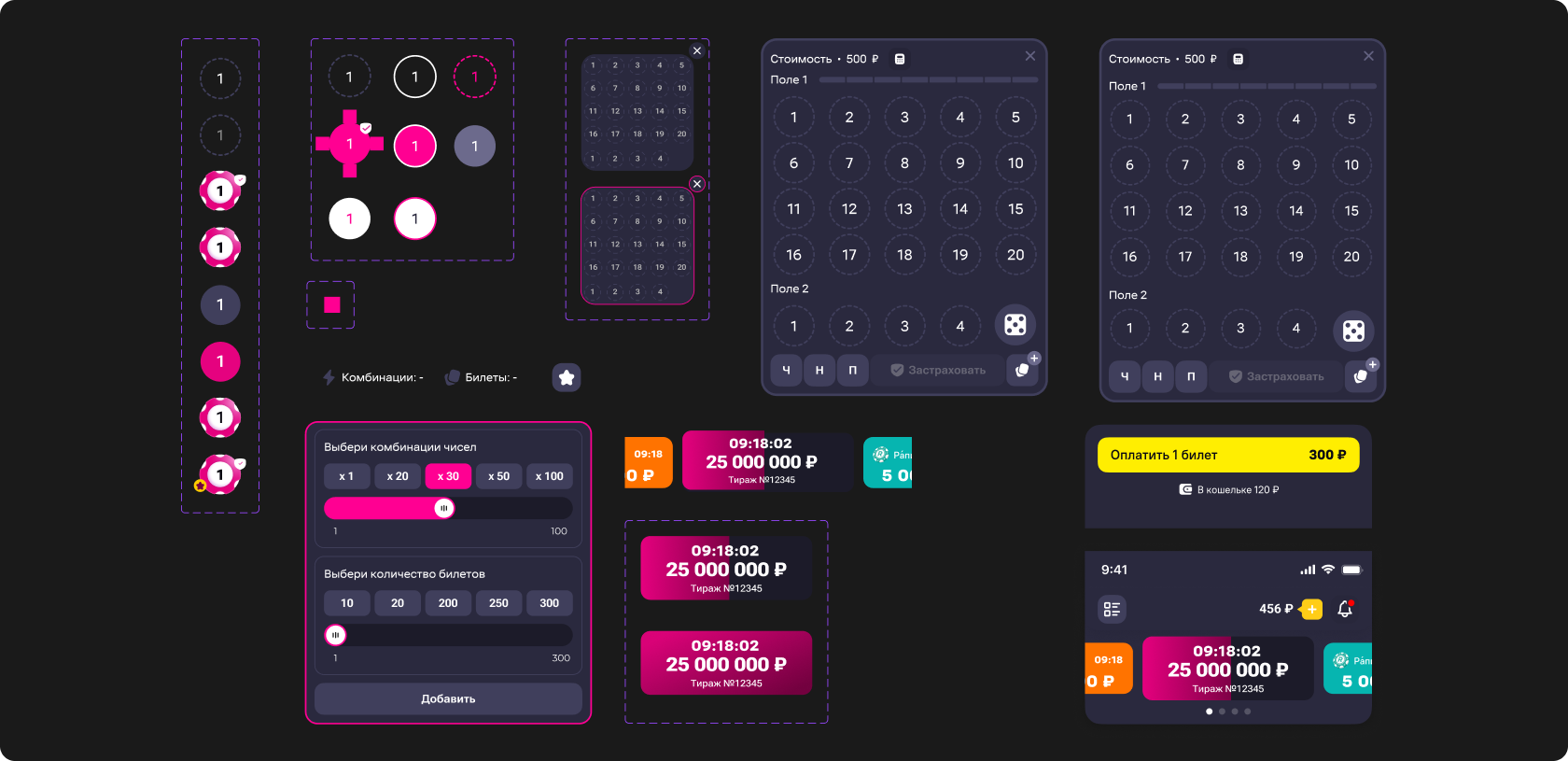
UI kit
Since Rapido was developed within the Stoloto platform, the base fonts, colors, and some components had already been defined by the system. That is why this section shows only the elements that were created specifically for the game.
Results
The exact project metrics remain confidential, so I do not disclose internal numbers in the case.
However, all solutions were designed as testable product hypotheses: for each change, we defined which part of the user journey it would affect and by which metrics it could be evaluated after launch.
The focus was on reducing unnecessary actions, improving interface clarity, and strengthening the user’s main path from entering the game to purchasing a ticket.
